Flexible Grids Are Perfect For
Responsive Web Design
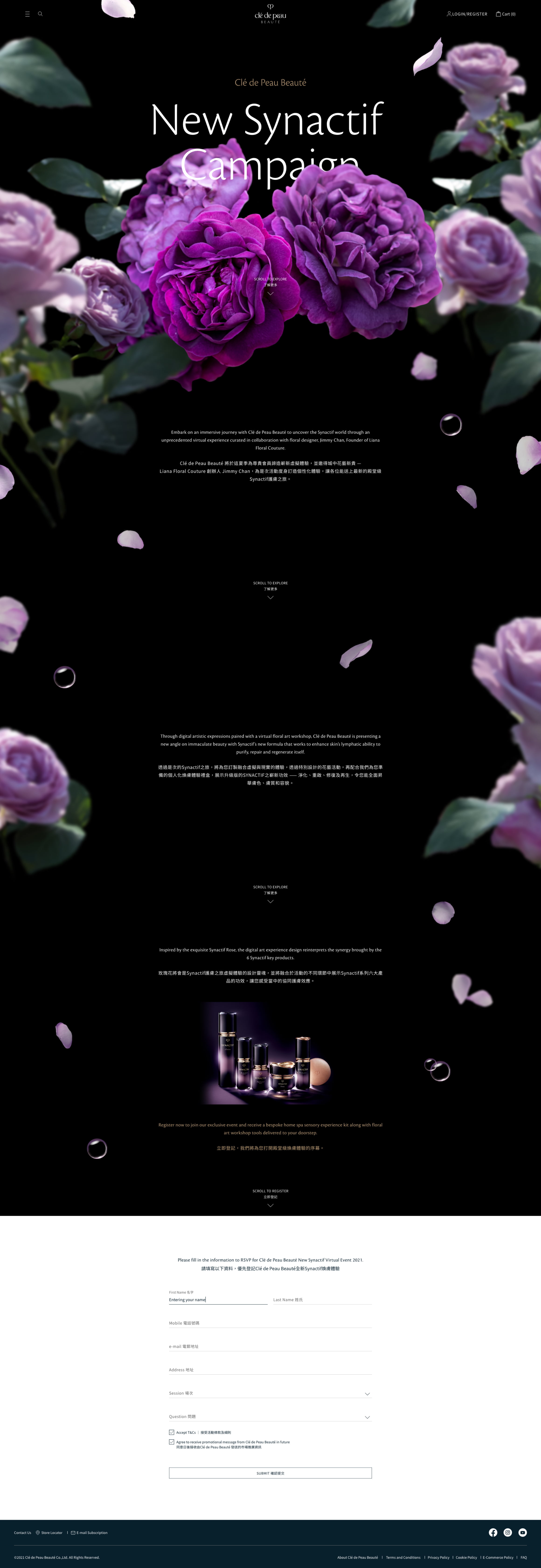
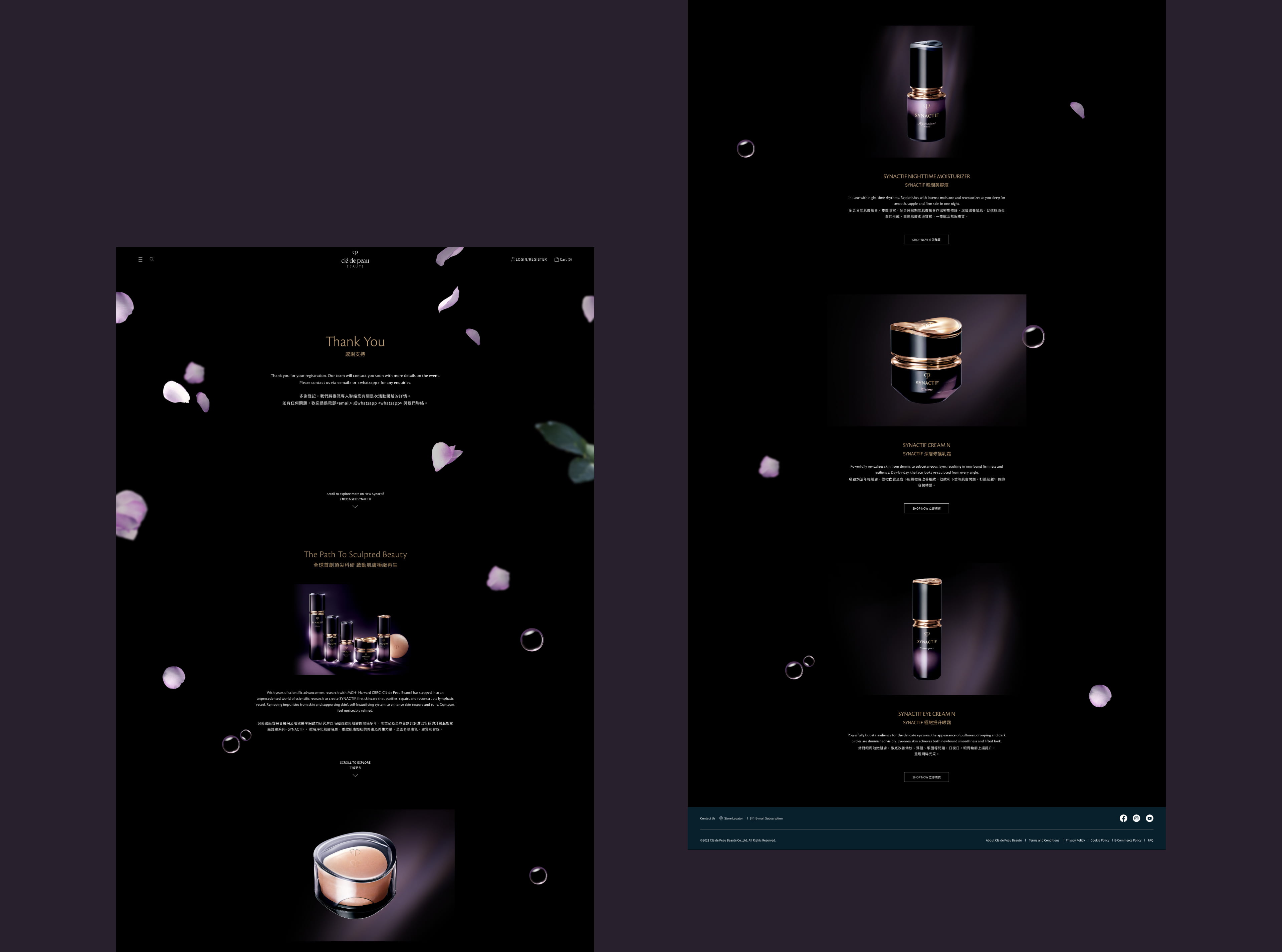
It is challenging to apply the parallax scrolling effect into mobile screen as perfect as in desktop screen. In order to maintain a consistent look and feel across multiple devices, I applied fluid grids to the interface design, so that the columns automatically rearrange themselves to fit the size of the screen.


